Salford Quays data-gathering walks

Phase III of The Tour of T’North:

Salford

I’ve been building some Colony ‘critter’ variants for exhibition at The Lowry as part of their Right Here Right Now showcase of contemporary digital art. During the exhibition, the animatronic forms will be moving in such a way as to ‘remember’ a walk taken around the surrounding Salford Quays area. This was the data-gathering part of that task where I did the walks and collected the data that would determine the critters’ movements.

murk

Day 1 was my first visit to the Quays and a chance to – literally – suss out the lie of the land. Amidst the drizzle and general greyness I walked around with what I hoped was a not-too-suspicious-looking rucksack full of batteries, GPS equipment, Arduino and data loggers.

dodgy rucksack

The critters are effectively claustrophobic and move more (get distressed) in response to being taken to places where buildings restrict their view of the sky (this links back to the quality of the GPS signal they receive – see the previous post for more information). In order for them to not just be doing the same thing all the time during the exhibition, I was therefore seeking out a range of built environments and collecting the data in order to get a feel for the ranges encountered. Media City provides a selection of massive office buildings with comparatively narrow walkways between them, but the quays also have some plazas and bridges out over the water as open spaces by way of contrast.

No two bridges the same, it seems.

Here’s the non-swinging swing bridge the Detroit Bridge.

Detroit Bridge

I checked the list of banned anti-social behaviours and arting wasn’t on there, so I did a few circles of the viewing platform en route across to the other side.

Bridge antisocial

The data I collect are in the form of many (tens of thousands) lines of text and numbers. To help me quickly see what sort of values I got and to relate these back to the landscape, I often convert the data into visual form and view them in Google Earth. Here’s the visualisation of the walk from that first day:

Recce walks

I had two different sets of kit in my rucksack, so each is represented by a different colour. The quick way of understanding what the visualisation shows is to think that the length of the lines corresponds to the extent to which the GPS signal is being affected by the built environment. It’s also important to remember that the lines can be deflected away from the actual path I took – I didn’t get my feet as wet as some of these traces might suggest! For example, the lines over the water towards the bottom left of the image above, were produced when I walked along the base of the wall of the Imperial War Museum; the effect of this massive piece of architecture being to throw the calculated GPS positions off by several tens of metres.

Imperial War deflections

The imagery currently in Google Earth is somewhat old, showing Media City as it’s being constructed:

buildings to be

I really like this combination of seeing the promise of the buildings that don’t quite exist yet and the invisible effects they then went on to have on the radio waves that also fill that space.

Having retired to my accommodation and spent some time examining spreadsheets and ranges, I returned for day two of the data-collection. This time with two critters.

clear sky

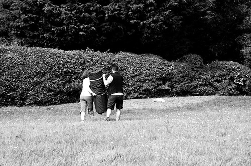
The skies were clearer this time around and I was met by Aliki Chapple, who had generously volunteered to spend the afternoon doing odd things in public places with a stranger off the internet.

Once fully bedecked in our moving wooden sculptures and their fabric slings, we set off to explore.

window reflection

By the end of the afternoon we had completed two different pairs of walks: the first was a bit of an epic loop around the edge of the Quays, mostly encountering different residential environments; and the second was a shorter one centred more on The Lowry and the Media City end of things.

Again we experimented with the effects buildings would have if we walked close to them; but we also encountered smaller masses and also had some interesting conversations with befuddled, inquisitive people we passed on our journeys. This is what Colony is really about: using the critters as a tool and as a permission object to pay attention to and explore the spaces we inhabit. They are also deliberately intended to be a conversation-starter.

Imperial War wall

residential

rusty slabs

Needing somewhere to safely leave the critters whilst we went to find some food, we also had some nice interactions with the staff at The Lowry – the cloakrooms were briefly home to some unusual inhabitants!

Cloakroom

Here are the visualisations of all four of the walks:

data vis

I was surprised by how little variation we got in the first, more residential, areas we walked in, although I was naturally expecting the overall effect from buildings to be less pronounced.

data vis

These screenshots are from Google Earth with the 3D buildings layer switched on. This is more up-to-date than the flat, base imagery, and it gives a real sense of that relationship between concrete and line length – check out the area in front of The Lowry (top right in the image above, with the tower) and also alongside the multi-story car park for the Lowry Outlet shopping centre (top centre – the blue lines are me walking from right to left along the base of the carpark wall, and then returning on the opposite side of the water, on the far side of the blocks of flats.):

Here are the lines from all six of the walks – quite a lot of ground covered!

All data

Next steps: converting these lines into code that the exhibition critters will remember and play back.

Of sweat and shops: a project in Longbridge

I’m just getting started on a commission from E-C Arts as one of the cohort of artists contributing to their public art project in response to the regeneration in Longbridge, Birmingham.

This area has begun to see regenerational changes in the wake of the collapse of MG Rover and the demolition of most of the car manufacturing plant that previously dominated the landscape.

Map of a small section of Longbridge – the brown bits are mostly that colour in real life as former factory land waits to be built on

My brief is to investigate movement in and around the area so naturally I started off by going for a walk…

I mostly only have prior experience of the area from driving through it on the A38 (the big green road in the map above) so I took the opportunity to explore off to the East and experience different types of landscapes.

After being involved in the BMW Guggenheim Lab project in New York a few years ago, I’ve become increasingly interested in aspects of urbanism and, in particular, the ways in which design and planning decisions impact back on our experience of a place.

So the following day I returned wearing this:

A simple skin conductance meter, with GPS and logging modules

This is a device that measures Galvanic Skin Response:

A change in the ability of the skin to conduct electricity, caused by an emotional stimulus, such as fright.
source

If you experience a strong emotion such as fear, pain, curiosity or joy, this has an effect on micro amounts of sweat your skin produces and this can be measured by its effect on conductivity.

Those two velcro straps around my fingers are holding tin-foil electrodes against my skin. When I feel, for example, pain, this increases the amount of sweat on my skin and this means that electricity can move more easily between the two contacts. This difference can be detected by the small circuit and this in turn is logged by a small computer chip (an Arduino).

I’m interested in how this effect varies as a move around a place, so I also added in a GPS module so I can log my position. I’ve never done this myself before, but I once took part in a bio-mapping workshop led by Christian Nold where he did much the same thing, so I thought it might give some interesting results.

On Sunday I walked for a couple of hours, seeking different types of space: the residential area of Austin Village and the tower blocks; busy roads and junctions, road crossings, car parks and a small section of cycle path.

As I walked I tried to pay attention to being wherever I was. You know how, quite often we filter out a lot of what’s going on around us as we move between A and B? Well I tried not to do that.

When I got home I mapped the data according to the GPS co-ordinates and colour-coded it according to the Galvanic Skin Response (GSR) data. Lighter colours relate to greater skin conductance. Triangles show the direction of movement.

There’s a lot of ‘noise’ because of the nature of the equipment and also because my hand wasn’t being held entirely still, but here’s the bit where I was walking around Austin Village and decided to explore down an alleyway (the spur to the right). Halfway down the alleyway a man came out of a side gate to unload his car, causing me to startle.

Walking from the top of the image, feeling quite relaxed, then turning left (right as you look at the image) down an unknown alleyway

Here is an overview of all of the data:

Galvanic Skin Response and GPS data combined into a map

Can you guess at what types of space I was walking through at each point, and how I was feeling in response to my immediate environment?

GPS Orchestra with the Digital Producers Lab

I’ve spent the last week running GPS Orchestra as an ongoing element woven through iShed’s brilliant Digital Producers Lab (a development programme for 12 producers working across Wales).

As a counterpoint to the programme of presentations and discussion settings led by some great speakers, GPS Orchestra was intended as a practical set of tasks to introduce working with GPS, electronics and the Arduino platform.

Starting with a ‘site visit’ out into Millennium Square, the producers were tasked with observing the space and thinking about how they’d like to nudge the atmosphere and/or behaviours they noticed.

That was the easy bit! What followed was a steep-learning-curved introduction to coding and prototyping to get them to the point where they could control motors and LEDs through live GPS data according to the movement of the contraptions they were to make.

Layering up the skills through the week, it was very heartwarming to hear that by Wednesday quite a few of the group were already planning to purchase Arduino bits and pieces to continue tinkering with after the lab!

By Friday lunch time – after only about 5 or 6 hours on their projects – they had made some amazing things:

  • Something that responded to the number of satellites it could see – initially intended to be rolled along the floor, but ended up getting lots of hugs.
  • Happbee – a wounded bee whose recuperation could be assisted if you carried him fast through the air as if he was flying.
  • The musical box – a small box that had the power to make you dance (or at least move differently).
  • The Digital Harp / y Delyn digidol – plays when you walk towards Wales and plays more the closer to are to the homelands.

It wasn’t an easy challenge by any means, but I was really impressed with the outcomes (not just the things they made). A lovely group of people and a very inspiring week overall. Thanks to everyone who contributed.

My photos from the week are at http://www.flickr.com/photos/nikki_pugh/sets/72157637471578064/, and below are a collection of Tweets relating to the sessions:

Landscape-reactive Sashes at Mobilities Futures

Last week I was up in Lancashire for the Mobilities Futures conference at Lancaster University. Mobilities has been brewing in the periphery of my awareness for a couple of years now, so it was great to get a chance to immerse myself in so many interesting streams of thinking.

I was part of the artists’ programme leading a workshop using the landscape-reactive sashes I developed with Fermynwods Contemporary Arts last year as a tool to feed into research for Colony.

The session was based around a small group of people wearing the sashes walking in a loose group, in silence, around the campus for about an hour. Naturally it started to chuck it down with rain just as the workshop started…

Brave souls venture out into the Weather

A quick redux for those that weren’t there: the sashes are connected by a mesh radio network, all receiving broadcasts from a central node. This central node is monitoring GPS data to get a measure of inaccuracies. These inaccuracies can be caused by many different things, but typically multipath error is the main candidate:

The multipath effect is caused by reflection of satellite signals (radio waves) on objects. It was the same effect that caused ghost images on television when antennae on the roof were still more common instead of today’s satellite dishes.

For GPS signals this effect mainly appears in the neighbourhood of large buildings or other elevations. The reflected signal takes more time to reach the receiver than the direct signal. The resulting error typically lies in the range of a few meters.http://www.kowoma.de/en/gps/errors.htm

Once it has a value for the degree of error, the central node then broadcasts instructions for the sashes to vibrate in a particular pattern. Thus the general pattern is that the more built up or undercover an area is, the greater the extent of error induced into the GPS data and the more the sashes vibrate.

In open areas people wearing a sash would typically feel a gentle pulse every 30 seconds or so. In areas where there is not such a clear view of open sky, the sashes vibrate for longer and more intensely.

Transitioning from an undercover area to a more open one

Out in the open, but with large buildings nearby. The response of the sashes may still be influenced by these – it depends on the position of the satellites

Being a fairly miserable Friday morning outside of term time, there weren’t many people out and about on campus as we drifted around. We were smiled at a few times and some of us were asked either for directions or if we needed directions.

The latter points to something interesting. Most of our sashes were covered up by coats in order to protect the electronics: in the absence of this signifier, the way in which we were moving slowly marked us out as being slightly different.

Afterwards, one of the participants – someone who works on the campus – commented on this change of speed and the opportunity it gave for reflective thought.

A few others too reported on how their thoughts wandered at different times. The vibrations from the sashes come through every 20 to 30 seconds and they’re pitched at a moderate level so that they’re there as a sense to tune into if you wish, but they also fade into the background if not.

At the end of the session we were able to take a quick look at a chunk of data rendered visually. After trying to relate the lines back to the landscape and the journey we’d made I then transferred the data to Google Earth. Ah! That’s where that happened!

In these visualisations the length of the lines relate to the intensity of vibration felt at that location at that time. The longer the lines the more vibration is felt

…and the same data in Google Earth superimposed over imagery showing the architecture on campus

I’ve made an A4 poster of all of the data from that day (the workshop and a test walk I did earlier in the morning) for you to download and print.

You can also download this .kml file for viewing in Google Earth if you’d like to see the data superimposed over imagery of the landscape.

My (somewhat grey and dingy) photos from the workshop are in this Flickr set.

Many thanks to the conference organisers, the workshop participants and everyone else at Mobilities Futures for a very interesting few days.

Heavy Objects at If Wet…

Last Sunday me and some Heavy Objects were at the monthly If Wet… salon.

Heavy Objects at If Wet... #5

In a Possibility Probe stylee, I was curious as to how these landscape-reactive devices would look when regarded within the context of musical instruments.

As ever, the most interesting things happened when I stopped talking and handed the objects over to the audience to take and explore with.

If Wet 5 - August - 11

If Wet 5 - August - 15

If Wet 5 - August - 16

If Wet 5 - August - 14

The photos above were taken by Pete Ashton – you can see all his images from the day in this Flickr set. All my photos are here.

Many thanks to Sam and David for looking after me on this occasion, and also for organising such an enjoyable and stimulating gathering every month. I can highly recommend making the trip down to Callow End to sample If Wet… if you’re not already one of the regular participants.

Art + Satellites

On the 2nd of July I took part in an ‘in conversation with…’ style event for Fermynwoods Contemporary Art: Art + Satellites. My conversation partner was Laura Tomei from Garmin (the GPS device folks).

There’s a recording of the event on the Fermynwoods website.

One of the things that came up was the language of GPS part of this was realising that GPS is only one dialect amongst many satellite navigation systems (GLONASS, BDS and Galileo being others)

I had a bit of an insight into my own practice and observed that perhaps what I was doing was also searching for alternative languages of navigation, often those that work on a more intimate scale: the whispers in the ear and the tug on the sleeve.

GPS Orchestra workshop at The Public

GPS Orchestra

As part of the Many & Varied programme at The Public over the summer, I’m running another of my GPS Orchestra workshops.

Again limited to 10 people, but this time supported by Arts Council and running over 2 days, the £40 ticket price represents quite a bargain – get yours now!

We’ll be using a combination of Arduino, simple electronics and junk materials to make a collection of noise-making devices that play themselves in response to how you move through a landscape.

Whilst coding experience might be useful, it’s nowhere near as essential as imagination, a sense of humour and a willingness to give things a try. Absolutely no musical ability required whatsoever.

I’ll guide you through what you’ll need to read live data coming in off a GPS module and use an Arduino nano to translate this into taps, rattles, swooshes and whirrrrrs through an assortment of motors, servos and the like.

By the end of the weekend you’ll have a great utility belt of translatable skills and enough know-how to buy your own kit if you decide this is something you’d like to do more of.

As I said, places are strictly limited, so get your tickets soon.

GPS Orchestra

GPS Orchestra raw materials. Add imagination.

Curzon Street GPS traces at Re:Call

The 3 composite GPS ‘fingerprints’ I have so far made from repeatedly walking around one of Birmingham’s ‘Eastside’ regeneration areas (the smaller, AWM one) have recently been exhibited as part of Re:Call at Bournville School for the Visual Arts.

Qualitative and Quantitative Data, 2011a (After the multistorey car park had been built, but before the roads had been closed.)

Re:Call is a rolling exhibition of work by graduates from the BA and Foundation courses that have been based at the site.

Re:Call in turn is part of ‘Art has left the building‘, a multi-strand project curated by Amanda Grist to commemorate and celebrate Bournville School of Art in the lead-up to its closure in July 2013.

Whilst the Re:Call exhibitions have mostly been aimed towards the Bournville community, on Wednesday March 20th there will be a public closing party at Ruskin Hall – all are welcome to attend.

3 – 6:20pm, Ruskin Hall, Bournville Centre for the Visual Arts [map]

The event also doubles as part of the fundraising activities for this year’s graduating students – this means there will be drinks and cake available to buy!

3 Bridges in Libre Graphics Magazine

When I was in New York in 2011, I made a few new pieces of work using my GPS difference technique. One of these was 3 Bridges, made by collecting the GPS data as I walked across the bridges that connect the Southern tip of Manhattan to Brooklyn. From North to South, these are the Williamsburg Bridge, the Manhattan Bridge and the Brooklyn Bridge respectively.

Each of these bridges is a completely different experience to walk across – you may be in a tunnel of iron girders, alongside busy subway tracks or out in the open with a criss-cross of suspension cables rising above you. The different characteristics of the the bridges are reflected in the different GPS ‘fingerprints’ shown by the lines in the drawing.

3 Bridges

3 Bridges has been reproduced in Issue 2.1 of Libre Graphics Magazine (entitled Localization/Internationalisation).

We react to regional differences, as well as efforts at internationalisation, in varied ways. In a world that has become increasingly globalised, we may hope for ways to communicate more effectively with others, or we may cherish our own regionally-specific terms and ways. We may create habits and classification systems which help us to trade knowledge and understanding with others, or we may take refuge in personal eccentricities.Editor’s Letter: Localisation and internationalization, ginger coons

I was given a sneak peek at the print copy a few days ago and it’s a lovely piece of work. You can order your copy from http://libregraphicsmag.com/ or you can download pdf versions to view or print yourself.

Morecambe noisy things

As a follow-on from yesterday’s GPS Orchestra workshop, artist Jen Southern and I today spent some time refining code, dreaming up new devices and generally prodding things with vibrating pager motors to see what interesting noises we could make.

The results were a few quick prototypes taken to Morecambe for some testing along the seafront in a surprise spell of sunny weather. We made a tapping box that indicates when it is being carried at different speeds (we haven’t quite got it right yet) and a tinned assortment of pager motors that responds to what direction you’re moving in (we tried it on foot at Morecambe and also in the car back to Lancaster – nice!).

It was really interesting to see what we could achieve with a handful of components: not only in terms of producing the device and its behaviour, but also thinking about how to effectively communicate changes to the person carrying the noise.


Copyright and permissions:

General blog contents released under a Creative Commons by-nc-sa license. Artworks and other projects copyright Nicola Pugh 2003-2024, all rights reserved.
If in doubt, ask.
The theme used on this WordPress-powered site started off life as Modern Clix, by Rodrigo Galindez.

RSS Feed.